How to Create a Consistent YouTube Thumbnail Style
Build a consistent YouTube thumbnail style with repeatable visual signals, flexible video concepts, and a 12-thumbnail audit that catches rigid templates.
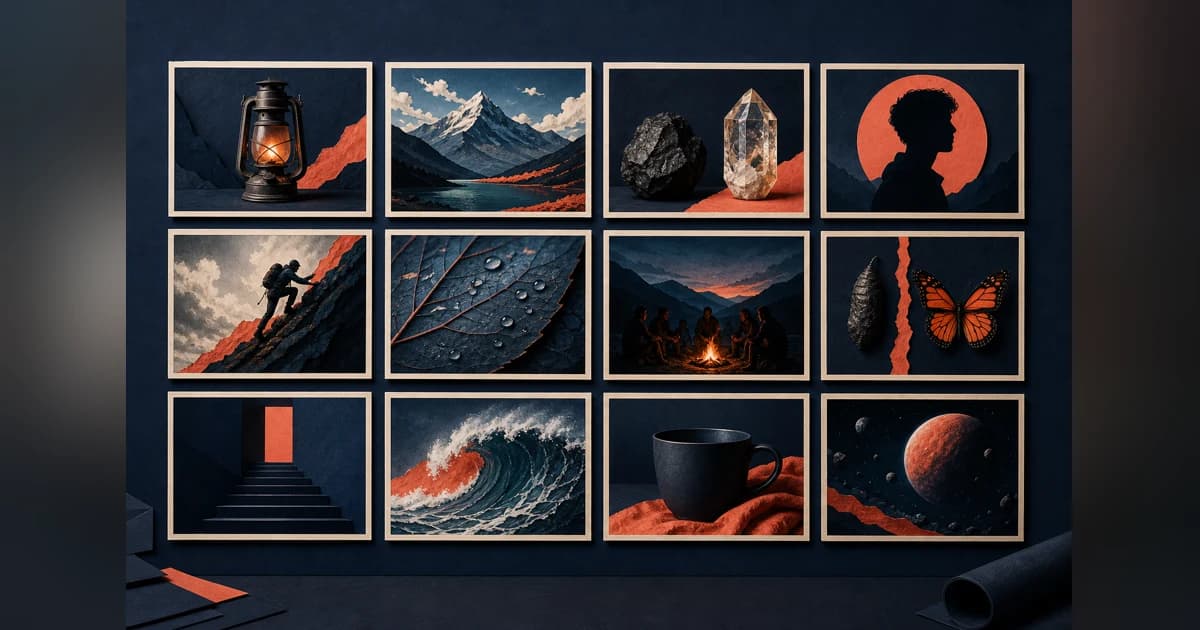
To create a consistent YouTube thumbnail style, keep two or three visual signals stable—such as type treatment, subject crop, color role, or border logic—while letting the subject and visual relationship change with each video's premise. Review your latest 12 thumbnails together at small size. If adjacent uploads need the full title to be told apart, loosen the system.
A useful style is a set of decisions, not one locked layout. Define what helps the channel feel related, what must change to explain this particular video, and when the normal rules should break. Then judge the archive and your own channel data separately: the archive shows coherence and differentiation, while YouTube Analytics shows how viewers responded.
Consistency is a system, not a locked template
A template fixes positions: face on the right, three words on the left, logo in the corner. A system fixes relationships. It might say that people receive a close crop, evidence gets one accent color, and text uses the same weight, while the composition changes according to the story.
That distinction gives each upload two jobs:
- A recognition layer carries a few repeatable visual signals.
- A premise layer explains why this video is different from the previous one.
The recognition layer should not consume the premise layer. A viewer still needs to see the product, person, result, conflict, or question that makes this upload specific. If every idea has to squeeze into the same face-and-headline split, the channel may look coherent as a grid while individual video ideas blur together at small size.
YouTube's current thumbnail guidance leaves room for that flexibility. It presents branding and descriptive text as tools, not requirements. It also notes that thumbnails appear differently across devices, audience tastes differ, and styles shift over time. A channel style therefore needs operating rules and a revision habit, not a permanent preset.
What our 36-thumbnail audit showed
On August 18, 2026, we inspected the first 12 latest entries from three public ThumbnailUp channel pages: GothamChess, The Financial Diet, and Appalachia's Homestead with Patara. We kept the returned order and made no substitutions after viewing the images.
The sample was chosen to compare three visibly different systems, not to study performance. We did not use views or outlier scores. For each thumbnail, we recorded the subject treatment, text treatment, palette or background, what repeated from nearby uploads, what changed with the premise, and whether adjacent videos became difficult to distinguish at contact-sheet size.
This is a comparative audit, not a representative study of YouTube. It cannot show whether viewers recognized a channel, clicked more often, or preferred one system. It can show how different channels keep some visual decisions stable without keeping all of them stable.
GothamChess repeated treatment, not layout
All 12 GothamChess thumbnails were face-led, but they did not share one frame. The repeated signals were large human subjects, hard foreground-background separation, dramatic lighting, and frequent cinematic compositing or illustration.
The premise layer moved constantly. One image turned the host into a sword-wielding character in an icy scene. Another used a broadcast frame with two players, a chessboard, scores, and timers. Other uploads used a four-person lineup, a close host reaction, an arena, or a single player portrait.
Only four of the 12 relied on prominent visible text or broadcast graphics. Seven used an illustrated or heavily transformed scene, while five stayed closer to photography or a live event frame. On the contact sheet, people received similar visual weight and heightened treatment even though the font, border, palette, and layout did not stay fixed.
The broadcast frame was the useful counterexample. It dropped most of the cinematic system because the event context itself carried the video. A practical style needs permission to make that choice.
The Financial Diet repeated typography and color roles
All 12 Financial Diet entries paired people with a prominent verbal premise. The stable layer was bold high-contrast type, rounded or blocked text containers, cut-out hosts or guests, and recurring purple, red-orange, teal, navy, and cream roles.
Within that system, the construction changed. Some thumbnails used a host and one large headline. Others built an editorial collage from guests, article clippings, social posts, invoices, or public figures. Backgrounds moved between photographs, flat color, repeating patterns, and magazine-like layouts.
This gave the channel room to cover interviews, cultural arguments, and personal-finance stories without abandoning its visual voice. The limit appeared in two adjacent interview thumbnails that shared guest scale, a patterned background, and a rounded central label. At small size, the new people and new words had to carry almost all of the distinction.
The archive exposes the tradeoff: when several layers stay fixed at once, the premise must work harder to look new.
Appalachia's Homestead repeated the host, frame, and outlined type
Nine of the 12 Appalachia's Homestead entries used a solo close portrait of the host. Eleven used a strong white frame and prominent outlined text. Natural or everyday photographic settings, direct eye contact, and stacked display type made the group immediately coherent.
The channel changed font, text color, setting, and supporting people. A couple selfie, a dark multi-person car frame, and a large outdoor event group broke the usual solo-host structure. Those exceptions were easy to separate from the rest of the set.
Several other entries placed a similarly sized face in one half and a long vertical phrase in the other. At contact-sheet size, the wording carried more of the topic distinction than the image. Long phrases also became harder to parse after reduction.
Each extra locked layer reduces the room left for the video-specific idea. Close portraits and outlined text can still work; they simply leave less of the frame available for another kind of distinction.
The shared pattern was controlled variation
The three channels kept different things stable:
- GothamChess kept subject scale and cinematic treatment stable.
- The Financial Diet kept typography and color roles stable.
- Appalachia's Homestead kept host crop, outlined type, and framing stable.
None of those systems can be declared the winner from public thumbnails. The practical common ground is controlled variation: repeat enough to create a family resemblance, then require the image to communicate a new premise before the title does all the work.
Build your thumbnail style in five steps
1. Start with the video jobs you publish most often
List the recurring communication problems in your channel, not the visual ingredients you happen to like.
A review may need to identify a product and deliver a verdict. An interview may need to establish who is speaking and what tension they will discuss. A tutorial may need to show a result, a broken state, or one crucial action.
If your system cannot serve those jobs, it will become decoration. A fixed host crop may be useful for commentary but costly when a product comparison needs both objects at readable scale.
Choose three to five common video jobs and note what must remain free for each one. That becomes the premise layer.
2. Choose two or three signal classes to repeat
A signal class is broader than one hex code or one exact coordinate. Useful options include:
- typography: weight, outline, case, or maximum line count;
- subject treatment: close people, clean product cut-outs, or natural scenes;
- color role: one warm accent for conflict or one cool field behind evidence;
- framing: a border, vignette, or recurring margin treatment;
- image treatment: documentary photography, flat collage, or cinematic compositing;
- layout rhythm: one dominant subject plus one supporting relationship.
Pick the few that matter most at small size. If you lock the font, palette, face position, border, logo, background, and text box simultaneously, you have probably built a form to fill rather than a style to use.
Write the rules as relationships. "Use a warm accent for the key contrast" can adapt. "Use red #FF0000 behind every face" cannot.
3. Give every upload one premise-specific change
Before opening a design tool, finish this sentence: "This thumbnail is different because it shows..."
The answer might be a physical comparison, an unusual guest pairing, a before-and-after result, a specific piece of evidence, or a reaction tied to a real moment. It should survive without the channel name.
Then decide which normal rule can move to support it. A product may need the space normally given to a host. A wide group may need a different crop. A strong location may make the usual color field unnecessary.
This is where consistency stops becoming repetition. The visual system supports the premise instead of asking the premise to decorate a template.
4. Define break rules before you need them
Special uploads should not force an improvised debate about branding. Write down when the system may bend and what stays stable when it does.
Possible break rules:
- a live event can keep the broadcast context instead of rebuilding it as a composite;
- an important collaboration can let the full group replace the usual solo subject;
- a visual transformation can drop text if the before-and-after reads clearly;
- a major series change can alter the palette while retaining the usual type treatment;
- an evidence-heavy story can use a collage while keeping one familiar color role.
Break one layer on purpose. If every layer changes, the thumbnail may feel disconnected. If none can change, the system has no way to tell an unusual story.
5. Check the archive, then check your own data
The archive answers visual questions: do the uploads look related, can topics be told apart, does the important material survive reduction, and is the newest image adding a distinct idea?
Your channel data answers audience questions. YouTube recommends evaluating thumbnails and titles in Analytics for the relevant audience and traffic context. Eligible creators can also run native concurrent tests with meaningfully different options.
Keep those evidence types separate. A tidy channel page does not prove stronger clicks. One test result does not establish a permanent brand rule. Use archive review to improve the system and channel-owned data to learn how viewers responded to a specific package.
Run the 12-thumbnail archive test
Export or open your latest 12 uploads in one view, then reduce the group until each image is roughly feed-sized. Do not start by grading the newest thumbnail alone.
For every entry, record:
- The first subject or relationship you notice.
- The repeatable signal that connects it to the channel.
- The premise-specific element that separates it from its neighbors.
- What becomes unreadable or visually merged after reduction.
- The closest look-alike in the 12-image set.
Then ask two different questions.
First: if the channel name disappeared, which signals would still recur? Those are candidates for the real style system. A tiny corner logo that nobody can see at feed size does not count.
Second: if the text disappeared, could you still tell adjacent video ideas apart? The answer does not have to be yes for every verbal topic. But if six uploads become the same portrait with different words, the image layer may need more premise-specific information.
Keep one counterexample. Find the thumbnail that breaks a normal rule but still explains its video clearly. It often reveals which part of the system is essential and which part is habit.
For a broader method of selecting a coherent comparison set and saving counterexamples, use the 30-minute thumbnail research workflow. If the style depends heavily on headlines, check the separate text-versus-no-text decision before adding another font rule.
How to research a channel style with ThumbnailUp
ThumbnailUp's public gallery lets you browse real YouTube thumbnails, open channel pages, and inspect titles, dates, visible traits, and public context without an account.
For a channel-style audit, open one channel page and keep the latest 12 entries in their returned order. Record the repeatable subject, text, color, framing, and image-treatment choices. Then record what changes with each video's premise and which adjacent entries become difficult to tell apart when reduced.
Do not treat automated tags as the conclusion. A text-density or face label can help locate examples, but the image still needs manual inspection. Keep the source URL and title beside every note so the package remains intact.
ThumbnailUp is a public research index. It does not expose private YouTube impressions or CTR, measure viewer recognition, or prove that a repeated style caused a video's public views. Use it to inspect the visual system. Use your own channel data to judge the result of a real thumbnail-title package.
FAQ
Should every YouTube thumbnail use the same template?
No. A fixed template can be useful for one recurring series, but a whole channel needs room for different subjects, relationships, and video promises. Keep a few visual signal classes stable and let the composition change when the premise needs it.
How many brand elements should stay consistent?
Start with two or three signal classes that remain visible at small size, such as type treatment, subject crop, color role, border logic, or image treatment. The exact number is less important than leaving enough flexibility for each upload to communicate a distinct idea.
When should a channel break its thumbnail style?
Break a normal rule when the video contains a stronger subject or context than the template can hold: a live event, collaboration, transformation, group, or evidence-heavy story. Keep one recognizable layer stable so the exception still belongs to the channel.
Does a consistent thumbnail style improve CTR?
Public channel pages cannot establish that. They do not provide a controlled alternative or private impressions and CTR. Review the archive for coherence and differentiation, then use your own YouTube Analytics or a native test to evaluate specific thumbnail-title packages.
Sources
- YouTube's thumbnail and title tips for current guidance on branding, complexity, devices, changing audience tastes, and channel-owned Analytics.
- GrabThumbs' channel-branding checklist for the current search-result baseline around repeatable signals, 12-thumbnail review, and the distinction between consistency and a locked template.
- ThumbnailUp's fixed 36-entry sample from three public channel pages, captured August 18, 2026. Inventory, images, and automated tags can change.
Open one public channel in ThumbnailUp, inspect its latest 12 thumbnails, and write down two repeatable signals plus the one thing that makes each upload visually different.