Minimalist vs Busy YouTube Thumbnails: How to Choose
Compare minimalist and busy YouTube thumbnails by focal claim, title fit, and small-size clarity. Learn when each style earns its space.
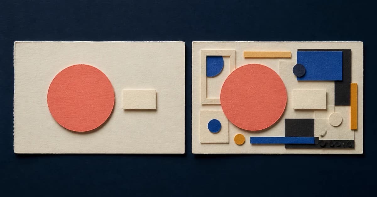
Choose a minimalist thumbnail when one subject or relationship can explain the video's promise. Use a busier composition only when the extra elements form a relationship viewers can still understand at feed size. Neither style is a universal winner, so check the real title and test original alternatives with your own audience.
The choice is less about counting objects than deciding what the viewer should understand first. A thumbnail can contain a person, two products, and a short label yet communicate one clean comparison. Another can show one portrait on an empty background and still leave the premise unclear.
Minimalist and busy are incomplete labels
A useful definition starts with visual claims. A low-complexity thumbnail makes one dominant claim. Its face, object, words, background, and color all support the same first read. A high-complexity thumbnail asks the viewer to process two or more meaningful scenes, subjects, labels, or callouts before the promise becomes clear.
This distinction explains why an element count is unreliable. A before-and-after image needs two states, but the relationship between them can be immediate. A product comparison needs two products. A group challenge may need several people. Those elements earn their place when the viewer reads them as one event.
Complexity becomes a problem when each part starts a separate sentence. One panel says "new product," another says "shocking result," a third names a feature, and a reaction face adds a fourth message. The viewer has to decide where to look before deciding what the video is about.
Minimalism has a failure mode too. Empty space does not create a premise. A clean portrait can look polished while relying on the title to do all the explanatory work. Aim for one legible relationship. Removing layers is only a means to that end.
What YouTube actually recommends
YouTube's thumbnail and title guidance tells creators not to make designs too complex because too much color and composition can overwhelm viewers. It also says thumbnails appear differently across devices, audience tastes vary, and styles shift over time.
That is situational advice. YouTube does not set a maximum number of subjects or say that every channel should use minimalist thumbnails. It treats the thumbnail and title as a package, then directs creators to their own Analytics to judge how that package performs with subscribers and broader audiences.
Current third-party advice is more confident. One exact-query minimalist versus busy comparison assigns simple designs to education and lifestyle, then busy designs to gaming and entertainment. A recent creator discussion frames the choice as one subject with little text versus multiple elements, effects, and words.
Those pages confirm the decision creators are trying to make. They do not establish a universal niche rule. The Reddit examples are self-reported. The comparison page does not publish a controlled method. Both are useful prompts for inspection, not performance evidence.
What our 36-thumbnail sample showed
On August 25, 2026, we captured the latest public ThumbnailUp entries from Tech, Gaming, and Lifestyle. Before checking performance context, we fixed a manual rubric based on competing visual claims. We selected six confident low-complexity and six confident high-complexity examples from each category, producing a balanced set of 36.
For every entry, we recorded the source URL, focal claim, relationship with the title, and what remained legible after reducing the thumbnail to 160 by 90 pixels. The sample is balanced by design. It cannot tell us how common either style is on YouTube, and it contains no private CTR or causal evidence.
Seventeen of the 18 low-complexity examples kept a clear main message at the reduced size. The remaining example still showed two people clearly, but neither the image nor its abstract title explained what the promised "new beginning" was.
Seven of the 18 high-complexity examples remained clear. In the other 11, the main subject survived but a label, secondary scene, or relationship became hard to read. Several vlog collages kept a broad "week in my life" message while losing the details that made that week specific. Dense software and news layouts kept a face or headline while their supporting evidence collapsed.
That count does not prove minimalist thumbnails perform better. We deliberately chose equal groups and judged visible clarity, not audience behavior. It does reveal the cost of separate claims. Small details disappear first, and when those details connect the composition, the promise disappears with them.
The counterexamples matter more than a simple score. An old motherboard, new CPU, labels, and reaction face remained understandable because the title resolved them into one compatibility experiment. A heater, presenter, and large phrase formed one appliance explanation. A crowded shopping collage stayed readable because every insert supported the same overconsumption claim.
When a minimalist thumbnail works
Start simple when one subject can carry the visual part of the promise. Product reviews, personal updates, demonstrations, landscapes, and strong game moments often have an obvious hero. Let the title supply the name, result, or question that would be awkward to force into the image.
A low-complexity package usually has three qualities:
- one dominant subject or relationship;
- supporting text that adds a verdict, label, or question instead of starting another topic;
- enough separation for the subject to survive at feed size.
The title still has work to do. In our sample, a server image with a warning symbol communicated danger, while the title supplied the data-center context. A portrait beside two phones showed the products, while the title named the leak. The image did not need to restate every noun.
Simple fails when it removes the information that makes the video distinct. A face without a readable emotion, subject, or relationship may only say "person." A product on a plain background may only say "review." If the title could fit ten nearby thumbnails without changing the image, the package may be clean but generic.
When a busy thumbnail works
A denser composition earns its space when the video's idea is a relationship among several things. Comparisons, transformations, collections, investigations, group challenges, and event recaps may need more than one subject.
The elements still need a reading order. A versus layout tells the eye to compare left and right. A before-and-after layout establishes time. A large label can name the relationship between several objects. Repeated items can communicate scale. These devices turn multiple parts into one sentence.
Busy becomes unclear when every layer wants to be the hook. Multiple headlines, arrows, badges, screenshots, faces, and effects may each be understandable alone. Together they can produce five openings and no main idea.
Ask whether removing an element changes the promise. If a tiny screenshot merely proves that research happened, it may belong in the video. If a second face adds no relationship, it may be decoration. If the title already names the product, the same label in the thumbnail may spend space without adding information.
Do not assume gaming requires clutter or lifestyle requires restraint. Our Gaming sample contained low-complexity game moments that stayed clear, and the Lifestyle sample contained dense collages that formed coherent event summaries. The video's communication job is a better starting point than its category.
A five-step complexity test
1. Write the focal claim
Finish this sentence before opening the editor: "The thumbnail should make the viewer notice..."
Use one concrete relationship, such as an old component running a new processor, a room before and after renovation, or one tool causing an unexpected result. If the sentence needs several unrelated clauses, the concept is already crowded.
2. Build the smallest complete version
Use the subject, crop, and contrast needed to express that relationship. Add text only when it supplies information the image and title cannot carry quickly. Treat this as a complete first concept. Do not plan to decorate it after the idea is already clear.
3. Make every addition defend itself
For each new face, screenshot, arrow, object, or label, ask what becomes clearer. Keep it when it completes a comparison, identifies the subject, or explains scale. Remove it when it only makes the design look more worked on.
4. Reduce the real package
Check the thumbnail at roughly 160 by 90 beside the actual title. Look away, then return and name the first claim you read. Note which detail disappears and whether losing it changes the premise.
This check can also expose a weak simple concept. If the large subject survives but its meaning depends on a tiny title nuance, the image may need one more piece of context.
5. Test different ideas, not decoration levels
Create alternatives that express the same video promise in meaningfully different ways. One might use a single result. Another might show the cause-and-effect relationship. Keep the title stable when you want the thumbnail comparison to teach you something narrow.
YouTube Studio's native test is where audience evidence begins. Public examples can help you form hypotheses. They cannot tell you which version your viewers would choose.
How to compare complexity in ThumbnailUp
ThumbnailUp's free library lets you inspect real thumbnails with their titles, categories, dates, visual tags, and public channel-relative context with a free account. Use it to build a comparison set inside your category, then code the first claim each package makes.
Start with 12 recent examples. Write the focal subject, any secondary claims, the title's contribution, and what survives at small size. Include at least two counterexamples. You are looking for the boundary where useful context becomes competition.
The gallery does not expose private CTR or prove that a simple or busy design caused a video's views. Automated tags are starting points and still need visual inspection. The broader 30-minute thumbnail research workflow shows how to keep the selection rule consistent and avoid copying the layouts you study.
FAQ
Are minimalist YouTube thumbnails better?
No style is universally better. Minimalist thumbnails often make one claim easier to read at small size, but they can also become vague or generic. Judge the thumbnail-title package, then use your own audience data.
How many elements should a YouTube thumbnail have?
There is no reliable maximum. Count independently meaningful claims instead of layers. Several elements can form one clear comparison, while two unrelated elements can already compete.
Can a busy YouTube thumbnail still be clear?
Yes. A busy thumbnail can remain clear when its subjects, labels, and callouts all explain one relationship and create an obvious reading order. Comparisons, transformations, and event summaries are common cases.
How should I test a simple thumbnail against a busy one?
Keep the video and title stable, then create two complete concepts that express the same promise with different information density. Check both at feed size before running an eligible concurrent test in YouTube Studio.
Open ThumbnailUp's free library, collect 12 recent examples from your category, and mark the first claim each one communicates. Use the counterexamples to plan original simple and detailed concepts, then test them with your own audience.